Optical Illusions are one of the more fun types of art. Some of these are created on a small scale (paper, posters) and others are created on a larger scale (buildings, trucks). The best optical illusions are the ones that keep you guessing for days after you’ve seen them. Here are some examples;
M.C. Escher (Maurits Cornelis Escher) was the master of optical illusions and was famously left-handed. Throughout his life (1898-1972) he created over 2000 sketches and drawings as well as 448 wood engravings, woodcuts and lithographs. He never finished high school but he enrolled in the School for Architecture and Decorative Arts which set him on a path that would forever change the graphic design world. Below you’ll see just a few of his amazing drawings;
The Golden Ratio is found by dividing a line into two parts so that the longer part divided by the smaller part is also equal to the whole length divided by the longer part. To put it simply, the Golden Ratio is a number, approximately 1.618, used in mathematics and nature to calculate to the proportions of something like an object, a persons body or face, etc.
It is symbolized using the 21st letter of the Greek alphabet, phi. Many famous painters and sculptors throughout history used the Golden Ratio to calculate the perfect proportions of their paintings and structures. Below are four examples of the Golden Ratio that can be seen in nature;
Harmony in design means connection… images and/or colours that are complimentary to each other create harmony. Certain images and colours can have a relationship with each other, a natural flow through repetition or through a rhythmic togetherness. A picture of a rainbow has perfect harmony colour wise but when a picture of a dark blue ocean is up against a bright red sky, they won’t play very well together and the two elements will look and feel unharmonious. Here is an image showing harmony;
Texture in design means the feel or the sense of the surface area of a design or artwork. Texture in a design can bring your image in to the real world or it can even allow a connection to be established for anyone who finds it hard to connect with something that isn’t down to earth. A cracked cement-like texture will give your image a ruggedness and a smooth steel-like texture will give your image an elegant, clean feeling. Here is an image showing texture;
White Space in design means an open area of or an abundance of ‘whiteness’ that at first may look empty and pointless but in fact it allows the focal point of your design (or artwork, etc.) to breathe in the open. Including white space in your work is a great idea if you are trying to emphasise something or if you are trying to draw people in by giving them space to think without complicating things. Here is an image showing white space;
Balance in design means a perfect harmony between equal parts of an image (E.g. halves, thirds, quarters, etc.). Striking a prefect balance in your design or image helps to bring everything together. It is said that perfect symmetry is a very attractive quality and it shows. Balance in game design is a very important thing especially with online games. An unbalanced game is unfair to everyone because it gives other players an advantage over the rest and can be the deciding factor when people decide whether they should purchase a game or not. Here is an image showing balance;
Scale in design means the size of something in relation to something else like two pieces of furniture in a room. Having the right scale of objects or images helps to make your design more pleasing to the eye and it is important for practical reasons as well. A giant staircase in a narrow hallway or a big piece of furniture blocking a view of the ocean is bad design and can be easily prevented by keeping scale in mind. Here is an image showing scale;
Emphasis in design means the point of your work that you want or need people to focus on. Having an emphasis on something in your design is a great way to get people to focus more on what you want them to see. An article in a newspaper, a person or object in a painting or a destination in the level of a video game… all of these things create an emphasis and highlight something the designer wants you to see. Here is an image showing emphasis;
Contrast in design means two parts of an image being different or the complete opposite of each other (through colour, people, objects, places, etc.). When you have one part of an image black and the other white it creates contrast but it isn’t always that simple and it can get tricky when you have multiple elements at play. Pitting an island resort against a dark, swampy landscape within a photo or an image will give you a good contrast. Here is an image showing contrast;
Salvador Dali was a master of surrealist art. Not only did he conquer surrealism, he had a love for all forms of art some of which he used himself. When he was younger he focused mostly on impressionism but over the span of his life he dabbled in photography, sculpturing, film, jewelery, graphics, watercolours, oils, performance pieces and many others.
Salvador Dali (Salvador Felipe Jacinto Dali I Domenech) was born in Figueres, Spain on the 11th of May, 1904. When he was a child living at home, his parents built him his very own studio where he would have the freedom and space to create his early works of art.
He went on to study in Madrid at a school named the San Fernando Academy of Fine Arts. His talent was recognized internationally from a fairly young age, in 1928, after three of his paintings were exhibited in the Carnegie International Exhibition to critical acclaim.
Over the years Dali developed a fascination for science and religion and he would incorporate both of these elements in to quite a few of his future works. He was lucky enough to escape from Europe to the United States during World War II and during his time in the U.S., he held his first major retrospective exhibit and he published his autobiography between 1941 and 1942.
Salvador Dali has gone on to inspire multiple generations of aspiring artists and he will always be remembered for his incredible mind and his never ending ability to evolve and delve in to new art forms.
Art and culture of the past is interesting because it has influenced and inspired many things we see in todays world. From modern architecture to artistic styles, we can see the past reflecting through the present in a big way.
Without arts and culture our world would be a dull place to live. They help us celebrate and discover the world around us and the people within it.Self expression is important to our wellbeing and being a part of a culture or creating art helps people by showing them a new perspective or by giving them a chance to try or see something new.
It is import and to look backwards to our history when trying to engage in design solutions for modern society because every new design throughout history has stemmed from something or multiple things from the past.
Almost every new trend in design is part of a pattern that constantly repeats itself and looking back at the history of design can show us where the pitfalls are and how others accomplished something that we’re struggling with. Doing this can help us break the pattern of success or failure.
At the base level of design there are simple processes that form many and understanding these processes can lead you in the right direction whilst avoiding any potential downfalls.
A cultures art is important to it’s people and it can socially affect itself and other cultural groups because the art produced by a culture is a deep rooted thing and a lot of people within any culture think of it as a part of themselves because it is usually representing them as a people.
Art can have a tremendous influence over anyone and particularly over a cultural group. All cultures have an image of themselves seen by the outside world and this can make certain people very protective of their identity and how others choose to interpret it.
Changes to a culture, a lot of the time, are inflicted by the culture itself in either a positive way or in a negative way. One of the ways this can happen is by way of artistic movements. For example the Renaissance or the Art Nouveau movement.
Many cultural influences have occurred in mine and nearly everybody else’s lives. From the words people speak to their religions to the food they eat. All of these are cultural influences that have changed and developed over a vast amount of time.
Being a part of a culture usually entails adopting the various cultural influences that it has as your own. By no regards are we forced to do this (in most cases) but given that you may have grown up with and spent your entire life under these influences, it seems to come naturally to people and can become a big part of who they are as a person.
Convergence is defined as two or more things coming together as one. Convergence in art and media refers to various forms of these mediums becoming unified.
Any company that’s worth its skin knows that expanding into multiple outlets and multiple forms of media highly benefits both the company and the consumer. Media and art convergence makes sense because a successful business needs profits and profits come from your customers and the best way to reach the customer is through advertising and exposure.
Convergence allows freedom to express yourself in many ways and can even inspire new ways of thinking that you wouldn’t have thought of beforehand. For example a game designer is creating a new game primarily on a gaming console. He or she goes about creating the game in the same ways that they always have by playing it safe using known hardware which allows for some innovation but never really changes things up on a drastic level.
The designer decides to try out a new virtual reality periferal that is a big risk for the developer because this new technology hasn’t quite adapted to their user base and it could turn out to be a fad. Suddenly they find themselves changing their perspective on game design completely because they have converged their existing business model with a fresh new way of thinking.
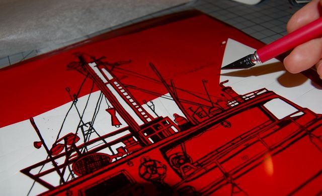
Rubylith was created by the Ulano Corporation and was the very first type of masking film created with two layers of separable acetate film on a clear base with a red emulsion in it.
It has many uses in graphic design including screen printing and offset lithography which uses Rubylith as a mask to block a source of light that can be used to create multiple printing plates.
This technology has evolved with the introduction of computers in several ways. One of the biggest evolutions was Web-to-print which allowed users to send their designs directly to a printer using the internet. This was a massive innovation because both parties, company and customer, saved time, money and avoided unnecessary problems like scheduling errors.
When the computer came along everything changed. Physically creating a design transformed into digital creation and in most cases the industry was the better for it. No more costly art supplies like exacto-knives, pens and pencils, fewer workers and now redundant equipment like light-tables saved the design industry a fortune in costs and gave designers more options which is a great thing to have.
This is one of the many jobs that I am interested in applying for;
The mandatory portfolio requirements for this job aren’t clearly listed but I assume I’ll need to demonstrate my abilities by showing the job provider my current and previous work in graphic design including TAFE work that I’m currently doing and any forms of art I’ve made in the past that can relate to this job.
The experience and skill that this job requires includes me having completed or being currently enrolled in a Graphic Design Course through TAFE or through Tertiary Education. I need to have a vast knowledge of Photoshop CS6, Illustrator and Adobe InDesign. I also need to have a good understanding of print production processes and artwork file formats. In addition to that i will need to have the ability to multitask, to be highly organised, to have an attention to detail, to thrive within a working team environment, to have an excellent work ethic, to be highly committed and to have a positive work attitude.
I have several portfolio pieces that would be appropriate for the position including my current work at TAFE and countless drawings and sketches that I have at home. I also have clay sculptures that I made during school that may apply to what I’ll be doing on the job.
I think both a digital and a print portfolio would be best suited for this position. My roles at this job will include print, design, branding, layout and photography so I think that having an extensive portfolio of both digital and print works will further increase my chances of getting this job.